Branding
A consistent brand identity: an introductory guide for companies
Branding starts with a clear message, then expresses it consistently through a company’s logo, colours, typography, and communication.
In this article
One good idea can be the start of something bigger.
A company communicates through many touchpoints: presentations, its website, proposals, social media, and conversations with customers. A brand identity helps all of these feel like they come from the same company.
Consistency does not mean every piece of communication needs an identical layout. What you need is a shared set of principles, so the team can create different materials without changing the company’s character each time. To build that foundation, start with the business message before choosing the visual form.
Explain who you want to help
Before discussing a logo, write down the company’s main customers, the needs it serves, and why your offer is relevant to them. Avoid statements so broad that almost any company could use them.
As an illustration, a logistics company serving food businesses might want to communicate reliable processes and easy coordination. This message gives a more concrete direction than simply wanting to look “professional and modern”.
Try summarising it in one sentence: “We help [customers] achieve [need] through [approach].” This does not have to become your slogan. Its purpose is to help the team agree on a direction and recognise the message that should appear repeatedly.
Define a character you can put into practice
Choose a few characteristics that relate to how the company works. These might include clarity, calmness, care, or friendliness. Then translate each characteristic into decisions people can observe.
“Clear” might mean service headlines that get straight to the point and proposals that are easy to scan. “Calm” can be expressed through generous spacing and information delivered without excessive exclamation marks. “Friendly” may show in how your team explains technical terms to customers.
With this translation, brand character becomes a decision-making tool. The team can assess whether a piece of communication follows the agreed direction, instead of debating only personal taste.
Build a visual system, beyond the logo
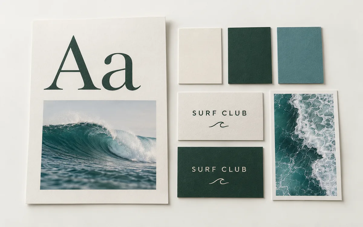
A logo is part of an identity, but it does not work alone. The visual system also includes colours, typography, layout, photography or illustration style, and the use of space. These elements need to work together.
- Logo: prepare versions suitable for light backgrounds, dark backgrounds, and small sizes.
- Colours: distinguish primary, supporting, background, and text colours so their uses are clear.
- Typography: define a hierarchy for headings, body text, and smaller information that remains comfortable to read.
- Layout: use spacing and arrangement principles that can work across different sizes.
- Images: choose photographs or illustrations that support the content and have clear usage rights.
Test the system on materials the company actually uses. A logo that looks good on a large sign may be hard to read as a profile icon. An appealing poster palette may be unsuitable for long website text.
Agree on how the company speaks
Identity is also expressed through words. Define the level of formality, how you address customers, and how you explain complicated subjects. A company can use professional language without becoming stiff.
Prepare practical examples for everyday situations: service headlines, proposal introductions, answers to questions, and updates when something goes wrong. Examples make guidelines easier to use than a list of adjectives without context.
If the company uses several languages, check that the message remains equivalent. A translation should preserve the intended meaning and communication style. Agree on how service names and key terms will be used, too.
Create guidelines that are easy to use
Useful brand guidelines answer questions when the team is working. Put the most frequently needed rules where they are easy to find, and include examples of correct use and things to avoid.
For an initial version, your guidelines can cover logo files, clear space, tested minimum sizes, colour codes, appropriately licensed fonts, and a few core templates. Add a short explanation of the message and writing style.
Store final assets in a shared location with clear file names. Separate working versions from those approved for use. Make it clear who can answer questions when a new requirement is not yet covered by the guidelines.
Start with the most important touchpoints
You do not need to update every piece of communication on the same day. List the touchpoints potential customers and your team see most often: the website, company profile, proposals, social media, or packaging where relevant.
Choose priorities based on actual use. A company that frequently gives sales presentations may need to start with presentation templates. A business that receives enquiries through its website should make sure the homepage experience fits its identity.
When updating materials, use a short checklist. Is the main message clear? Do the logo and colours follow the guidelines? Is the text readable? Does the communication style fit? These simple checks help reduce unintentional differences.
Leave room to grow
Your brand will be used in situations you could not anticipate when the first guidelines were written. Create a way to add templates or rules as needs arise, while preserving the underlying principles.
Review the system when a new service, a different audience, or a difficult-to-create asset comes along. Distinguish changes that require an extension to the guidelines from those that call for a new company direction. They involve different scopes of work.
The aim is to help the team work with confidence. A good identity provides guidance while leaving room to communicate information clearly.
Prepare a concrete branding brief
Gather the company’s context, main customers, offers, existing materials, and the problems you want to solve. Explain whether you need a new identity, improvements to specific elements, or more consistent implementation.
Include examples of materials that feel appropriate, and explain why. Describe operational constraints, too, such as print sizes, the devices your team uses, or language requirements. This information connects design decisions to their intended use.
The identity can then be applied to your company website and suitable marketing channels. When preparing your website, bring together the visual guidelines, main message, and available assets in a business website brief. Once those requirements are clear, explore Saka Digital’s website packages to decide on your next step.
Websites by Saka Digital
A website that fits your business.
Choose a package based on your content, how you’ll manage it, and the customer journey you need.
View website packages